
Ithaca College Navigation Redesign
Project Background
For years, Ithaca College's website had a hidden crisis. The information was there, but no one could find it. Key resources, like the Registrar, Career Exploration, and specific schools, were buried under vague labels or stranded as "orphan pages" only accessible via Google or a direct link.
Our analytics painted a clear picture: users rarely used the main navigation. Instead, they overwhelmingly clicked the search icon as a crutch to navigate the site. The current IA simply didn't match how real students thought.
The goal was to make the primary, utility, and footer navigation intuitive for prospective and current students, reducing confusion and surfacing hidden gems.
UX Designer
2 Developers, 1 PM,
Marketing Agency
(February - January)
Impact
32%
reduction in search reliance
2.5x
increase in "Student Life" section traffic
25%
decrease in
clicks to reach top pages
How we got there: The Problem
The Problem
How we got there: The Problem
A Pattern Hiding in Plain Sight
They just leave. Or they hit search.
When I pulled our analytics, the numbers were hard to ignore. 18% of all clicks on the homepage, almost one in five, went straight to the search icon. Not to Admissions. Not to Academics. To an empty search bar.
That's not a user preference. That's a red flag.
I remember sitting with the heatmap data, watching red blooms cluster around the search bar like a heat signature.

What Students Taugh
Mixed-methods Approach
They just leave. Or they hit search.
When I pulled our analytics, the numbers were hard to ignore. 18% of all clicks on the homepage, almost one in five, went straight to the search icon. Not to Admissions. Not to Academics. To an empty search bar.
That's not a user preference. That's a red flag.I remember sitting with the heatmap data, watching red blooms cluster around the search bar like a heat signature. Meanwhile, the "About" section sat there cold, barely registering 0.6% of clicks. Not because nobody cared about Ithaca College's story. Because nobody could find it.
The numbers were whispering a clear story:
- 12% of all tickets were just asking where is the Save button?
- 25% were "which dropdown option does X?" Especially between nearly identical components.
- 0% of editors could insert content above an existing block. Only append. Then drag. YIKES.
The dropdown problem wasn't laziness, it was legibility. Two different components had nearly identical names but behaved differently. One editor had accidentally rebuilt the same callout box three times because she couldn't tell them apart.
The save button wasn't laziness either, it was invisible affordance. One editor had lost 20 minutes of work when she hit "back" instead of "save" (which was off screen).
And the append-only architecture? That was pure learned helplessness. Editors had built workarounds like duplicating whole pages just to add a new paragraph at the top.
Connecting Research To Redesign
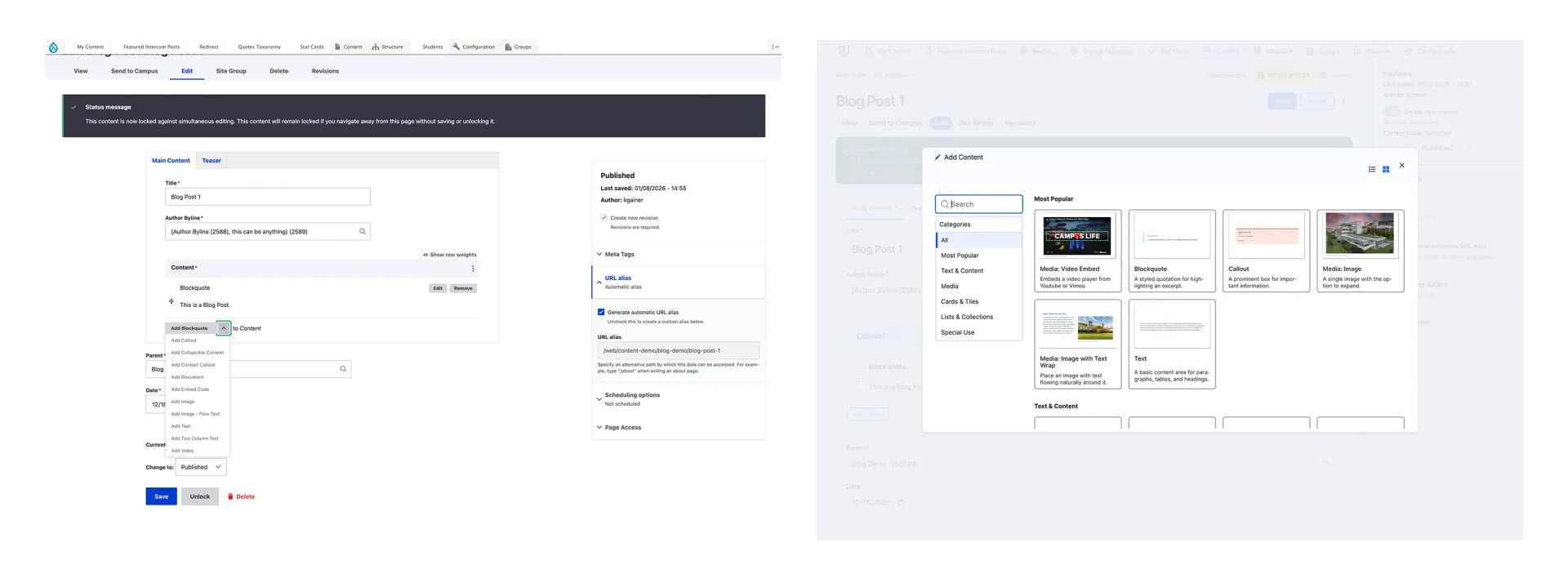
Decision 1: Kill The Dropdown. Build a Gallery
So I asked myself: What would actually help someone choose?
The answer came in four parts:
- Show them what it looks like → Add image previews
- Tell them what it does → Clear one sentence descriptions
- Organize by goal, not alphabet → Create buckets based on real usage patterns
- Name it for meaning → Rename everything from "Card Featured" to "Spotlight Slider"
The dropdown became a gallery. The guesswork became recognition.
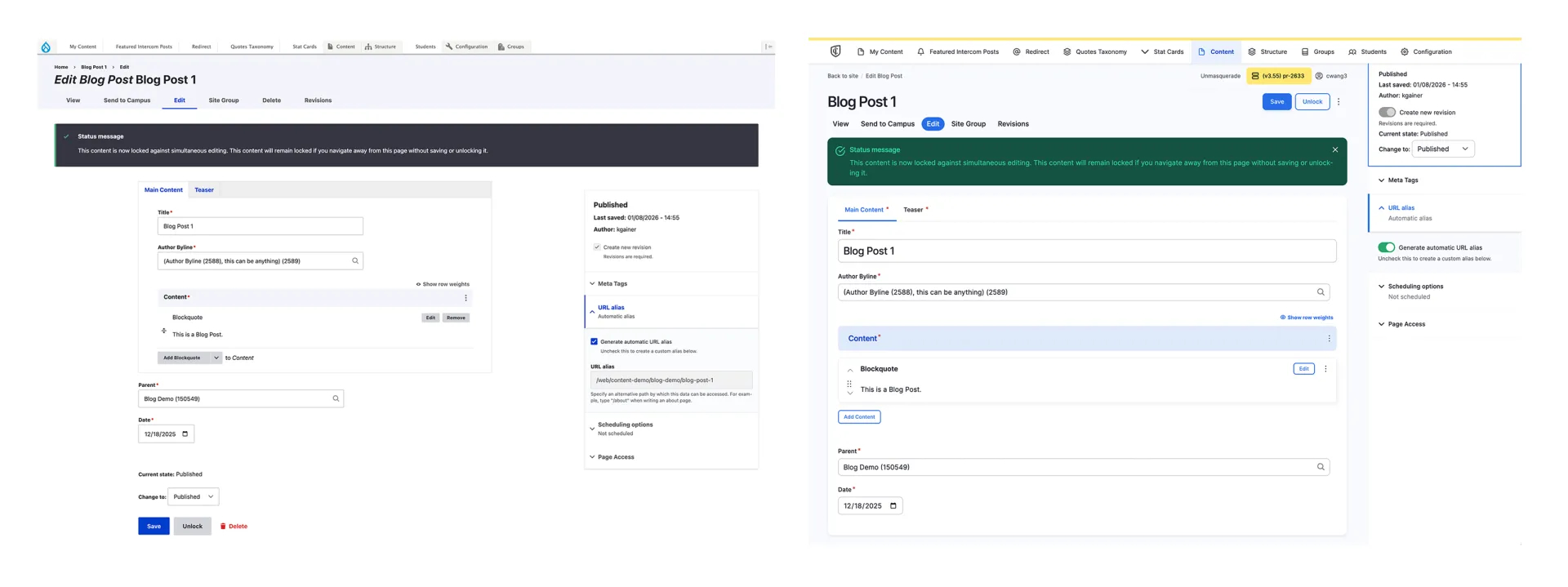
Decision 2: Make Save Impossible to Miss.
I realized the page layout was treating Save like just another field at the bottom of a form. But on a page that could be 10 screens tall, the bottom might as well have been another zip code.
The fix was simple: detach Save from the scroll. Pin it to the top. Always visible. Always one click away.
Decision 3: Let Editors Add Content Anywhere
The technical limitation was legacy code. But the user need was simple: I want to put this new section right here, not at the bottom.
I worked with the developers to add visual reorder handles and an "add here" button between every existing component. No more append and pray. Just drag, drop, or click.
What We Built: Three Before & After Moments
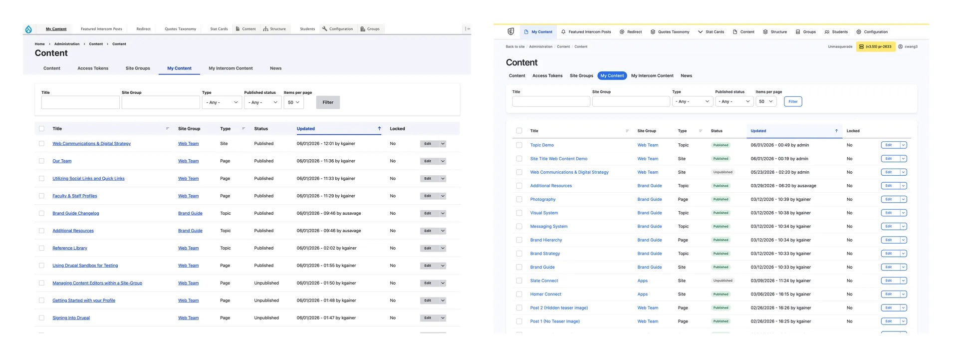
Finding Your Content (Overall UI)
After: Cleaner typography, subtle spacing, and a light hierarchy. Same columns and filters, just organized for the human eye. Scanning for a specific page now takes seconds instead of a double take.
Editing a Page (The Save Button That Follows You)
After: A clean, persistent bar locks to the top of the screen the moment you start scrolling. Components can be reordered, edited in place, and added above an existing one.
Adding a Component
After: A full-screen gallery modal. Every component is now in a card, image preview, simple description, categories filter, and search. The dropdown is gone. The guesswork is gone.
Root causes:
- Renamed 15+ components for clarity
- Merged or removed duplicate components
- Written 40+ descriptions
Launch & Results
Pre-launch Communication
The Rollout
Immediate Outcomes
30-day Metrics:
- Component selection error: 65% lower
- Returning weekly editors: +28%
- Abandoned edits: 52% lower
What I'd Do Differently
1. Test on older devices.
2. Add "Recently Used" to the component gallery.
3. Interview the people who never filed a ticket.
The Takeaway
What I'll carry forward:
- Name components for what they do, not for internal logic.
- Watch users work — tickets tell you what, observation tells you why.
- The best metric isn’t always planned. Unsolicited praise from a relieved editor told me more than any KPI.